
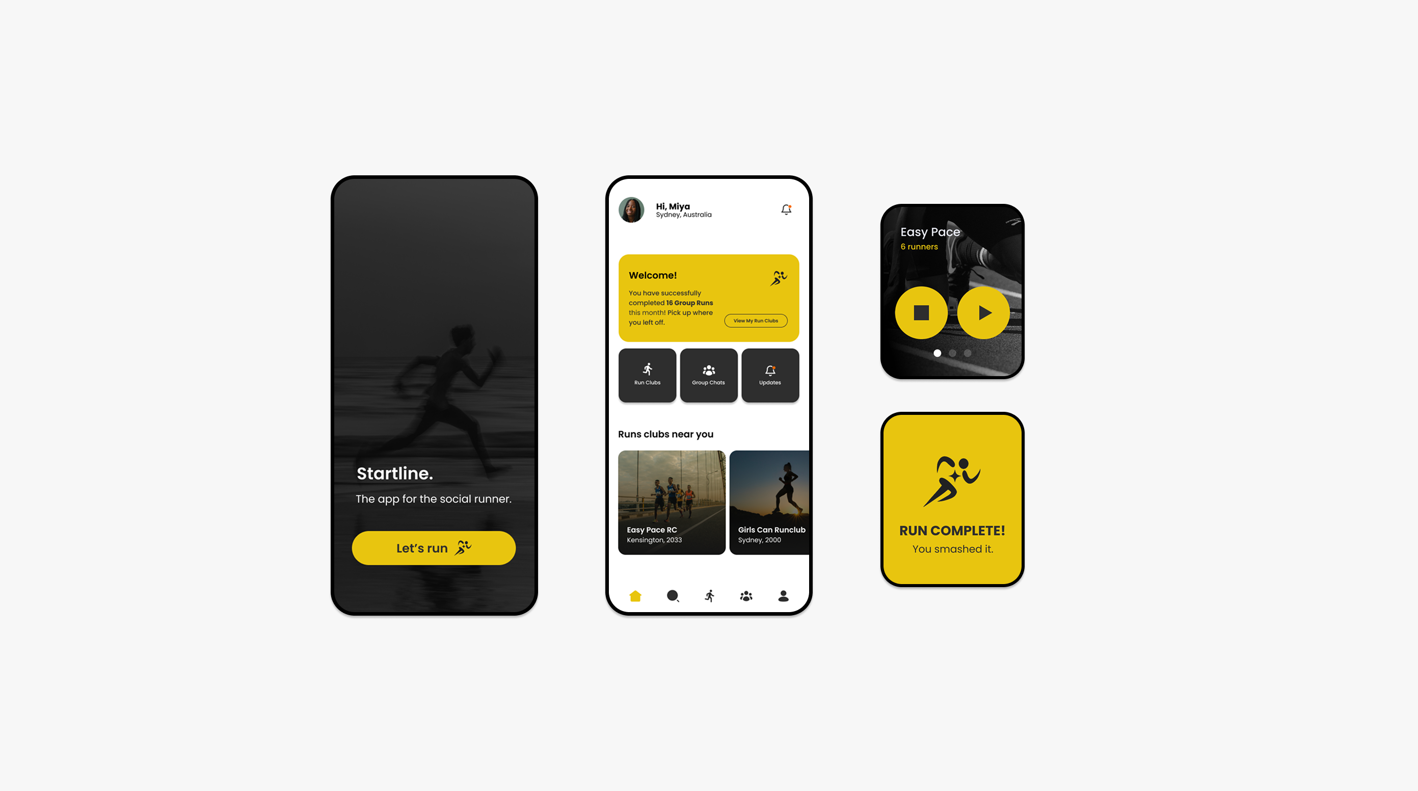
Startline Run Club
Startline is a social run club app I designed to solve the coordination problem that messaging apps were never built for. By bringing group chat, location sharing, run scheduling, and live tracking into one place, and designing it across both mobile and Apple Watch, the app makes getting a group of people to the same place at the same time feel as effortless as the run itself.
What does a running platform look like when coordination is the core feature?
The problem with existing tools
Social runners already use messaging apps to coordinate, but those apps weren't built for it. I mapped four specific issues across existing solutions before designing anything: Location sharing is buried and easy to overlook, Iconography is unclear and users can't tell what an action does before tapping it and there are limited confirmation screens when sharing locations which can lead to errors.
Initial prototype
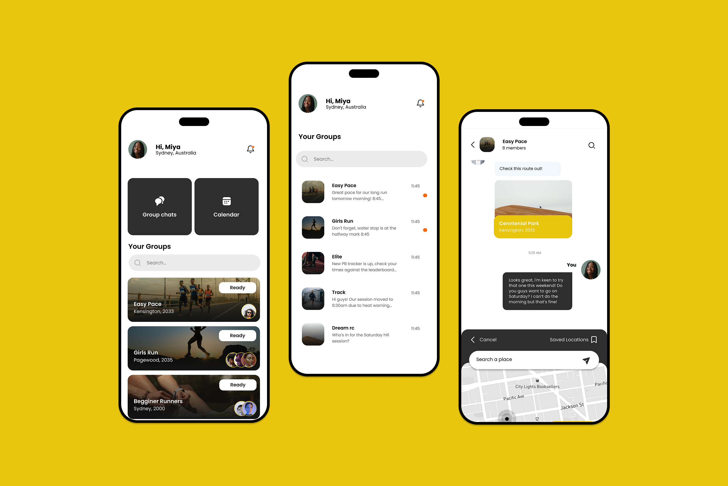
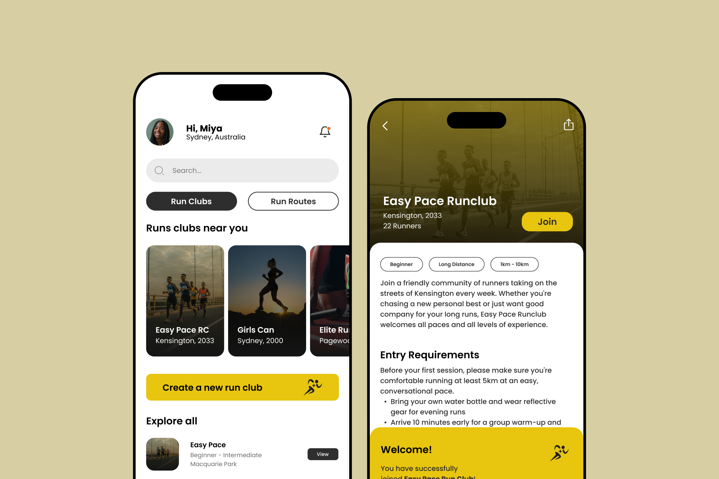
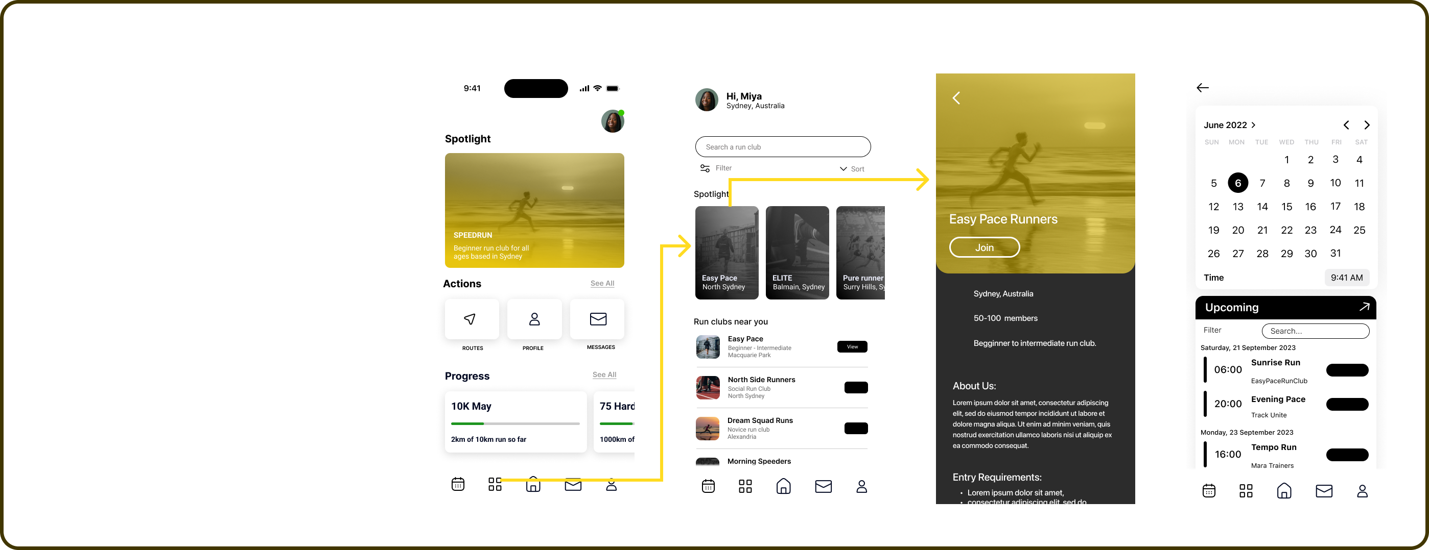
The first prototype covered browsing and joining run clubs, creating a group, and a group chat with coordination tools built in: polls for voting on run times, quick-access location sharing, and a run tracking shortcut.
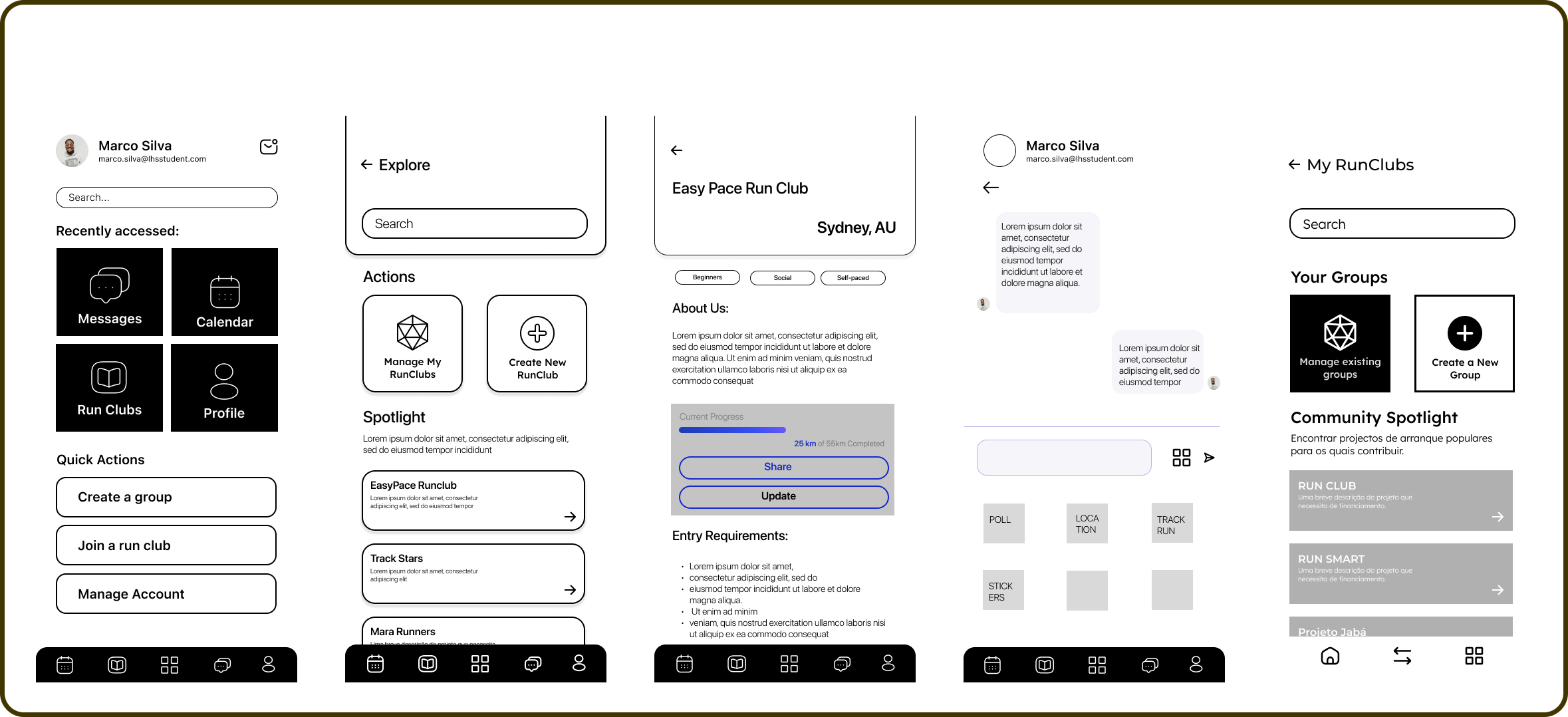
Feedback from peers identified three problems: navigation to the run clubs section took too many steps, the group chat and run club sections felt disconnected, and the home screen was doing too much.
User Testing: Multi-device Design
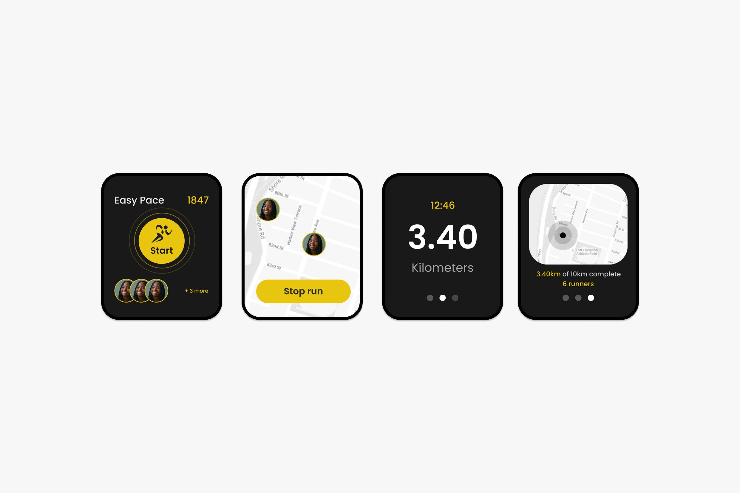
From the start, Startline was designed for both iPhone and Apple Watch. The phone handles the social and coordination layer; the watch handles the active running experience.
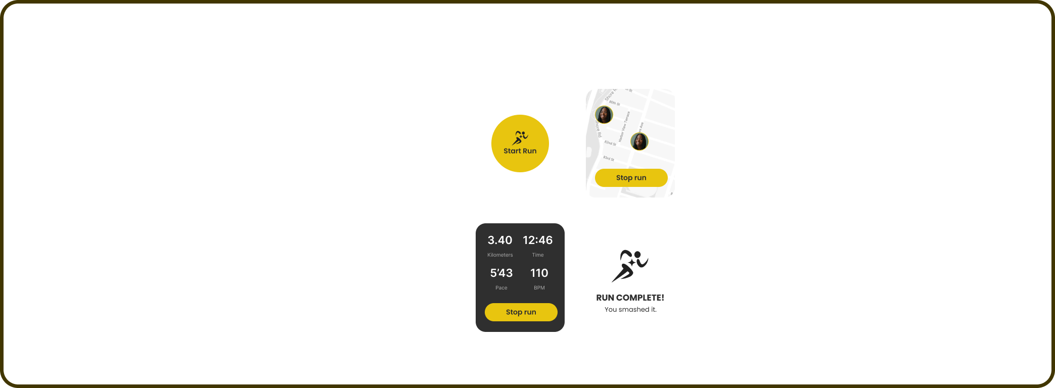
Testing the Apple Watch prototype surfaced a tension. Users found the design clean but flagged that the running tracker screen had too much information, distance, time, pace, BPM were too small to read while moving. Evaluated against Andy Budd's heuristic of minimising unnecessary complexity and cognitive load, the watch screen was asking too much of someone mid-run.
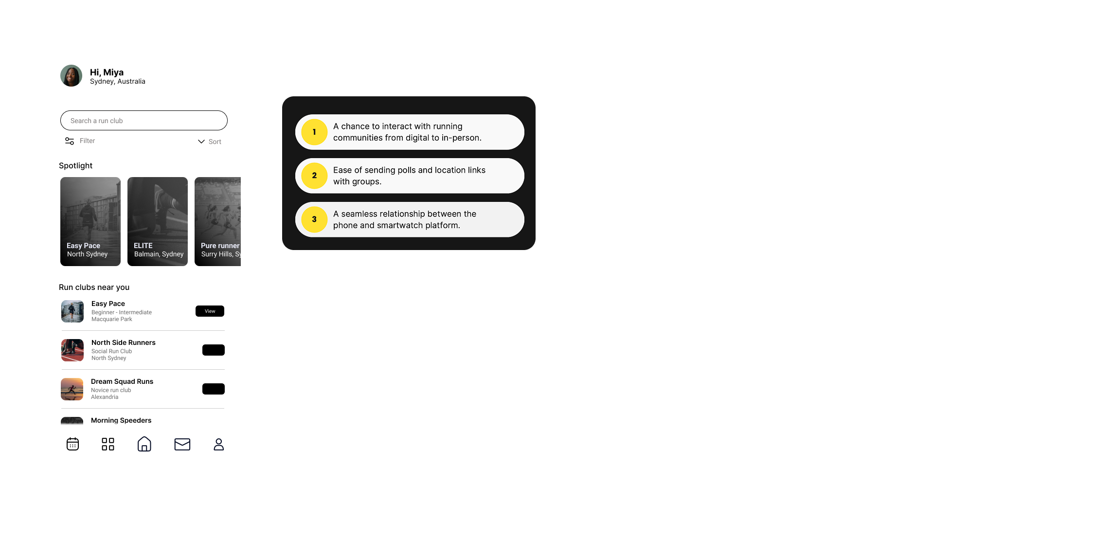
The iPhone testing flagged a separate issue through Nielsen's heuristic of flexibility and efficiency of use: too many steps to reach the core feature, and the message icon was being read as email rather than group chat.
Final prototype
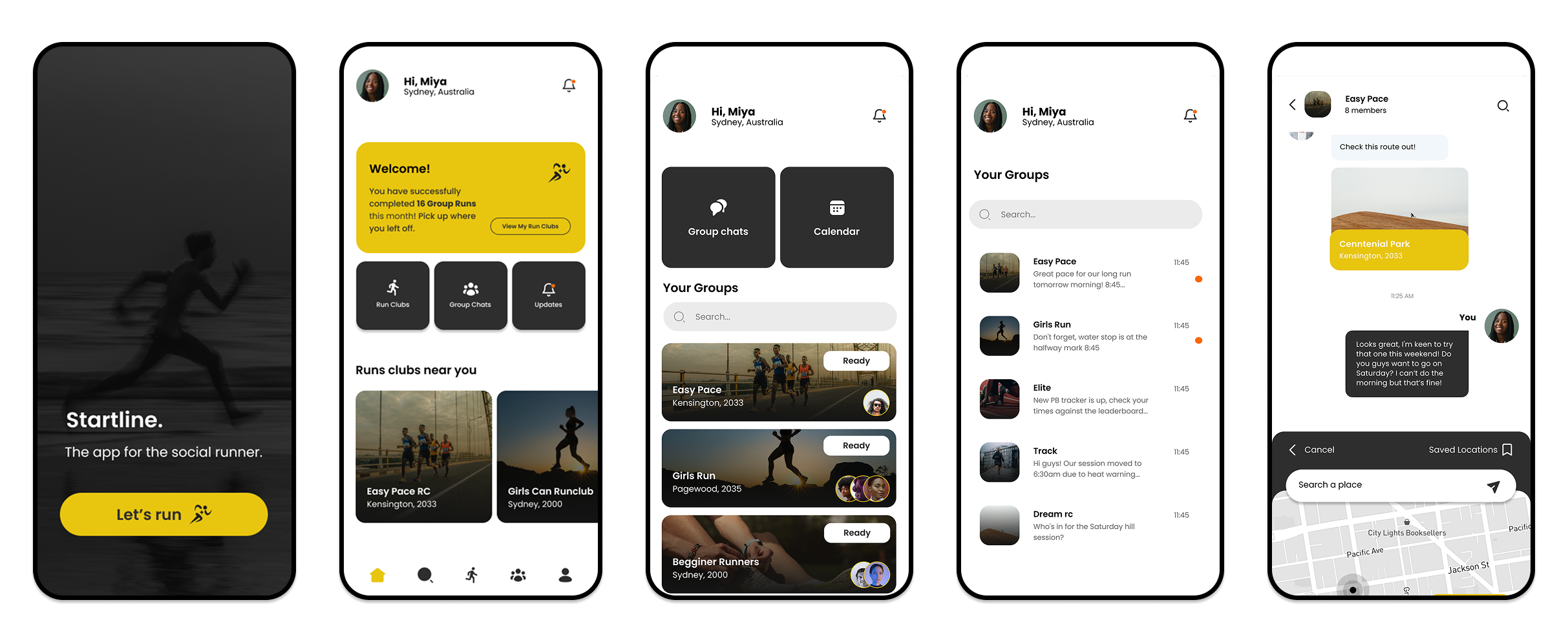
The final design restructured the home screen, shortened the path to run clubs, and more clearly linked the group chat and run club sections. The watch interface was simplified to prioritise the two things a runner needs mid-run: the group's location and current pace.
.gif)
.gif)

